
Microsoft Windows Vista came out just a few days ago. This is a major update to the world’s most popular Operating System and comes with numerous ‘improvements’ in both its underlying frameworks and components and its appearance and user-oriented features.
One of the hightlights of Windows Vista, according to Microsoft, has been its renewed
æsthetics and graphical prowess. Translucency, shadows, the inclusion of 3D features, a
composited desktop, effects. Features that — for the most part — have graced Mac OS X users’ desktops for more than 4 years. There is a tendency in the computing industry to associate eye candy with usability or evolution of the desktop paradigm. Sometimes it so happens that a features could be characterised as both an advancement in usability and eye candy; but more than often this is not the case.
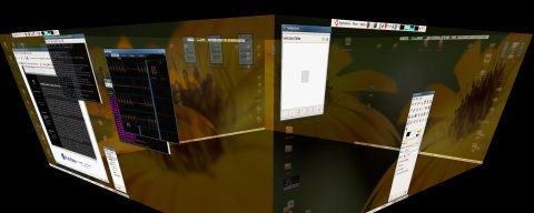
On the linux front there is a considerable amount of attention and work spent on projects such as Beryl and Compiz, the former being a fork of the latter. Compiz seems like a well thought-out project, slower, less cutting-edge, but more practical, in the sense that it is actively supported by Novell and Novell makes a commercial, corporate-friendly distribution of linux (yes, I know about its agreement with Microsoft). Both projects offer intuitive, useful features, such as the cube-based desktop switching (see image above), an Exposé ripoff for application switching among a variety of effects, animations and eyecandy. Beryl, the community-driven fork, focuses on cutting edge effects, fully configurable plugins and frequent releases. Dozens of sliders, tweaks, options for each animation, for each plugin, for each parameter of the software. Numerous different animations for minimising, maximising and restoring windows. It’s a mess. And it’s configuration is neither usable nor particularly useful. I’ve tried them both and I’m sorry to say that — for the time being — neither really pushes the envelope: compiz provides an (at this time) unfinished and underperforming addition to the ageing linux desktop and beryl an (often) unstable, pointless die-hard version of the former. Yet they both hint at what could be a linux desktop utopia: a beautiful, modern and above all open 3D-capable but usable desktop environment. Having translucent rain falling on my desktop is not exactly useful or needed. The improvements on the linux desktop are important and useful, but ultimately superificial as most (all) linux application frameworks lack support for advanced graphical functionality.
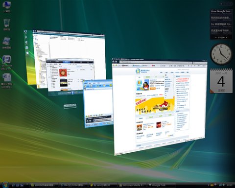
Windows suffers from some of the same symptoms: eye candy for the sake of eye candy, although its end-user features are more polished and very limited; take the 45º, cascaded Win-Tab feature found in Vista’s Aero; while it might seem more usable, it isn’t. It is a bad rip off of Apple’s Exposé. And Exposé is very usable, giving you thumbnails of each and every window on the desktop or a those belonging to the currently active application with a single keystroke. You can see everything laid out in front of you and pick the window you prefer. Microsoft’s 3D cascaded alt-tab isn’t that great: you can only see part of the windows. I doubt it’s faster or more intuitive than the old-fashioned 2D Alt-Tab switcher, even after years of use. Both Windows’ and Compiz’s Alt-Tab on the other hand seem much more intuitive: a traditional alt-tab screen-centred window with a live thumbnail and the icon of each application. The difference between linux and windows is, however, that Windows has a brand new set of frameworks, waiting for developers to make use of them to create next-generation applications, whereas linux doesn’t.
Pointless eye candy is not only afflicting the Windows and Linux worlds. Mac OS X suffers from pointless eyecandy too: take for example the ‘Genie’ minimise animation, the Dashboard widget ‘splash’, Leopard’s TimeMachine over-the-top interface. Many third party applications are also suffering from useless eyecandy. The ultra-minimal Mac OS X optical disc burning application Disco is an example. While it’s gorgeous, the black particle-based smoke emitted from the application window while a disc is ‘burning’ is kind of pointless now, isn’t it? Yet Mac OS X, despite its limitations — e.g. up until Leopard there has been no official* support for Virtual Desktops, there’s complete disregard for the HIG by practically every medium to large application, and almost every single Apple application — has probably done more for user interface evolution than any other operating environment these past few years. And, sadly, that’s not because Apple did exceptionally well, it’s mostly because no one else does anything.
I find æsthetics to be paramount for good user interfaces. I cannot stand aliased text, ugly interfaces, cluttered design. Eye candy does not equal æsthetics however. Most of the window decorators provided with Beryl are butt-ugly designed by (arguably tasteless) amateurs. Some of the best ones are decent, yet nothing spectacular. And while no one can deny that Beryl provides ample eye candy, few will argue that its effects or looks are good. The same argument can be used — to some extent — against Vista’s Aero look, primarily impressing millions of sad users of Windows that probably wet their pants seeing a Gaussian shadow under a window or a translucent decoration. OS X has been æsthetically pleasing for the most part with the brushed metal overkill and the inconsistency of the styles being my main issues with it.
Great user interface design is hard and it’s all too easy to stick to what’s easy, what’s there. While Beryl/Compiz crash, don’t play well with Open GL applications, while linux graphics drivers suck and while application frameworks are updated to properly support the graphical features needed for modern desktop interfaces, deepening the skin-deep modernisation that the newfound composited desktops have brought, while Microsoft keeps busy copying features found on OS X for more than four years and presents them as ‘new’ and ‘innovative’, while Apple constantly violates its own HIG and spoonfeeds its fanboys (and girls) with fancy animations or eye candy to cover up for its lack of real features, the crucial problem of developing user interfaces remains. I guess most people don’t care.
* Since OS X originally inherited a very large part of *STEP, a platform that supported virtual desktops, private/undocumented and unsupported API functions for virtual desktops remained in OS X. They were put to good use by the Desktop Manager project.
Windows Vista Win-Tab image taken from Flickr and used under Creative Commons Attribution Licence.