Lucida Grandε.
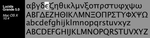
This has been itching me ever since I installed Leopard. Lucida Grande, the ‘default’ font for much of OS X’s UI has been ‘upgraded’ to version 6.0.
This wouldn’t be a problem (or even noticeable) if the new Lucida Grande hadn’t replaced the glyph for the hellenic character epsilon with the ugliest, most striking version ever to grace my Mac. Since Hellenic is my mother tongue, I frequently use it and was immediately striken by the new glyph although it took a while for me to realise what it was that bothered me. Take a look at the following two samples of Lucida Grande 5.0 (from Mac OS X ‘Tiger’ 10.4) and Lucida Grande 6.0 (from Mac OS X ‘Leopard’ 10.5).
Old:

New:

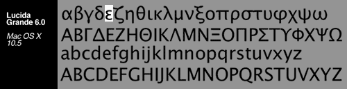
Ugly? Very much so. I suspect they changed it so that those that use Hellenic for mathematical/physics notation can get a more ‘appropriate’ epsilon. To them I say: Use LaTeX for Typography’s Sake! At least the rest of the font is still as beautiful as ever.


Okay, you are a bit paranoid on these issues, but if you call this an upgrade I fail to see differences in my 12” iBook screen.
Χμμμ… Προτιμώ το καινούργιο epsilon.
Είναι πιο ελληνικό…
Nikoxy: This is not about hellenism. It is also not about æsthetics (or their subjectivity). My post was mostly referring to the technical and æsthetic integrity of the glyph (from a typography standpoint). My problem with the new epsilon is not that it isn’t lunate, but that it seems rushed, disproportionate and largely unfitting to be part of this beautiful font.
By the way, the lunate epsilon is as hellenic as the open one — they come from different eras, but they are both of hellenic origin. Oh and another thing: Please observe the language of the post when commenting.
I agree with Nikos. I don’t do my epsilons that way (down with the \varepsilon), but it does seem to fit the rest of the font a bit better than the original. But, eh.