
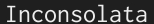
A few weeks ago I stumbled across Inconsolata, Raph Levien’s monospaced font and it has since become one of my favourites. The font is clearly inspired by Consolas, the new monospaced font designed by Lucas de Groot for Microsoft’s Windows Vista Operating System. Inconsolata borrows several characteristics of that font, but is longer in height (Consolas is too ’rounded’ for my taste, even though it is by far one of the most æsthetically pleasing monospaced fonts I’ve ever seen) and, as the Inconsolata web page explains, borrows from a wide variety of fonts and styles.
There are a number of reasons I am not using Inconsolata on my development machines yet. First, it is completely devoid of any Hellenic characters, which for me is a problem as, more often than not, I come across them. Second, I prefer monospaced fonts where zero (0) is slashed as opposed to just thinner than the capital O. Obviously, Raph disagrees. While my latter ‘complaint’ is not that important, the former is.
I can only hope that in the future Raph will extend Inconsolata to support the Hellenic alphabet too.
Raph states that the completion of this font is sponsored by TUG and that donating to TUG would help finance the design and implementation of other fonts by him. If you’re interested in seeing this amazing monospaced font finished and possibly extended to support Hellenic drop Raph an email (check his page for details). Also, consider donating to TUG’s DevFund.