
Months before Windows 95 came out in late August 1995, a number of screenshots from β versions of the much touted and eagerly awaited operating environment had circulated both on the, then nascent World Wide Web, and the computing press.
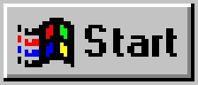
Among the most profound changes from earlier incarnations of Windows was the introduction of the ‘Start’ button and accompanying menu, that replaced the earlier ‘Program Manager’ and provided easy access to documents, applications, settings and system features from a single place, conveniently accessed through an obvious button located at the bottom left of the computer screen. The significance of the Start button was huge, compared to what Windows 3.11 offered. It made it very easy for new users of Windows (and back then most of the population would’ve been new users of any operating system) and at the same time consolidated so many features under a single roof, it satisfied the needs of power users. There’s no denying that the Start button was, overall, a ‘good idea’, yet one that was — as is so typical with Microsoft products — badly implemented. You see, the bottom-left placement of the Start button was supposed to make it dead easy for someone to just slam the pointer to the bottom left of the screen, with minimal regard to precise positioning, and just press the left button, thus opening the Start menu, but the Start button on Windows 95 (and subsequent versions) failed to do this as it was inset by a number of ‘dead pixels’, a border that was not included in the button and did not respond to mouse clicks. Gone was the prospect of just moving the pointer to the bottom left corner and pressing the button; you still needed to move it a few pixels to the top and right in order to get the Start menu to appear.
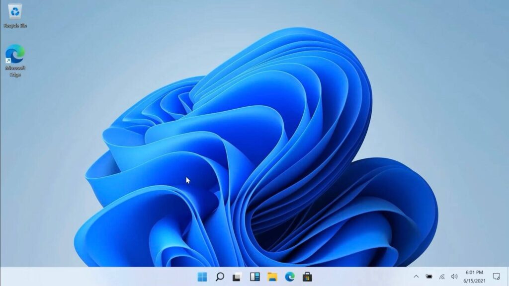
Fast forward 26 years and Windows 11 is announced with the totally inexplicable centering of the Start button alongside other ‘pinned’ apps. And since resolutions vary, as does the number of applications one may pin to the taskbar (if they still call it that), the actual position of the Start button is also variable, destroying one of the few things Microsoft got right from a usability perspective, more than a quarter century ago. It’s dumbfounding how a company of the size, experience and wealth of Microsoft can mess things up so badly.
After almost a decade following the Windows 8 UI schizophrenia, the hodgepodge of an operating environment that was Windows 10, with UI elements mixing everything from a few residual win16 dialogs from the early 1990s, Metro Modern UI and ‘classic’ Windows 7-era UI elements, Windows 11 looks like more of the same, sub-par, badly thought out, uninspired design we’ve been used to getting from Microsoft. Even the somewhat awkward presentation by Panos Panay and his associates, somehow linking the usability regression that is centering the taskbar to Windows 11 being the center of your something didn’t seem to make any sense whatsoever.
Add to this the requirement for TPM modules, a hotly contested subject about 20 years ago that led to Microsoft’s plan to require its presence to be shelved, after strong popular and manufacturer reaction, and it’s quite easy to expect Windows 11 to get a much less enthusiastic reception than its predecessor, even though its OEM-based sales model and lack of alternatives will, no doubt, ensure it sells ‘well’.