Following on from my earlier post on the upcoming Ubuntu 8.04 ‘LTS’ release, I fear that my prediction, albeit harsh, was pretty accurate: Ubuntu 8.04 LTS should have never been branded as a Long Term Support (LTS) release. Despite the obvious shortcomings of having β-quality software (Firefox 3.0, GVFS) and new frameworks that — statistically — are going to break things for some people (Pulseaudio is one example; gvfs another) there are tons of bugs that I would classify as ‘Medium to High’ priority and that the Ubuntu devs could not possibly fix in time, don’t know about or probably don’t consider that important anyway. Despite all this, 10 days before release, Ubuntu Hardy is a ‘joy’ to use, if you can see beyond the LTS branding, treat it like a bleeding edge linux distribution and cope with the bugs and general instability that more or less define it; compiz, nautilus, the gvfs back ends, firefox — are all great; when they don’t crash.
Sadly, they do crash. More than I’d like. While I respect the decisions of the Ubuntu devs, I believe it is absolutely clear at this stage that a release as ‘bleeding edge’ as Hardy should have never been tagged with LTS. Still, I’m pretty confident that the steady stream of bugfix ‘updates’ will keep on coming (I’m counting more than 150-200MB daily) and hopefully by June Hardy will be a solid, usable release for everyone.
The Flags
On to more pleasant things. One of those small things that I generally dislike about Gnome is its keyboard indicator applet. This is, for those not familiar with it, a small indicator showing the currently active keyboard layout in Gnome. Some years ago it was replaced by the current version (gswitchit). Some years before that, as a result of a huge controversy involving countries regions characterised by political instability/oppression/foreign occupation/etc. GNOME developers dropped what is customarily used to indicate the selected language in graphical environments, that is flags, and replaced them with a text-only indication of the language. So for, say, US English and Hellenic (Greek) you get ‘USA’ and ‘Gre’.
Despite all this, the code for the flag display was retained and accessible through a boolean gconf option, showFlags, found through gconf-editor at /desktop/gnome/peripherals/keyboard/indicator/.
The option is self-explanatory: it replaces the text indication and displays flags instead. You get to choose the flags you wish to use by placing them in ~/.icons/flags (or /usr/share/pixmaps if you want them to be accessible system-wide) in, say, PNG format and naming them after the appropriate ISO 2-digit code. So, for example, for Hellas (Greece) you get gr.png, while for France it’s fr.png and so on.
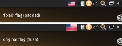
The problem with that solution? Well, the implementation is ugly. Extremely ugly, at least to my eyes. For some completely unknown reason, the developer of the applet chose to use the whole height of the panel to show the flag. This creates a very weird effect, as most widgets and text on the GNOME panels are smaller and usually padded at the top and bottom — in some cases there is no explicit padding, but due to the various shapes and implicit padding of the icons the illusion of padding is achieved.

Tonight, after enduring the ugliness for so long, I spent about an hour familiarising with the relevant code and seeing what I could do to fix things. Fixing the size thing was very easy (two lines) and a quick recompilation of libgnomekbd and the flags now look much more in tune with the other widgets on the panel at 65% of its height, and much more aesthetically pleasing — again that’s just my opinion, let me know what you think. Since I reckon few are using the flags (most people probably don’t even know about this possibility) and even fewer would actually spend time bothering with this, I thought I’d just mention it here with the hope that someone else might be interested in this ‘hack’. There’s still some room for improvement here, as the allocated ‘real estate’ on the panel is still that of the larger image. I hope that the developers/maintainers of the library and the gswitchit applet will, some day, opt for a ‘padded’ flag like the one above. The crude patch for libgnomekbd that achieves the padded effect is here. Ah, the joys of open source… 🙂
