
Google Earth οι μεν, Lonely Planet οι δε.
Διαβάζω στη Καθημερινή [μέσω buzz] πως μέλη των Ταξιαρχιών Μαρτύρων του Αλ Ακσά δηλώνουν ανοιχτά πως κάνουν χρήση του Google Earth "προκειμένου να εντοπίσουν τους στόχους των αυτοσχέδιών τους ρουκετών". Kαι σχεδόν ταυτόχρονα διαβάζω το εξής άρθρο στο BBC News το οποίο συνοδεύεται από απόσπασμα video [RealPlayer] του νέου ντοκυμαντέρ του BBC 'No Plan, No Peace' στο οποίο δηλώνεται 'ανοιχτά' από την ταγιεροφορούσα συνταξιούχο εδώ και μια τριετία Αμερικανίδα διπλωμάτη, Barbara Bodine, πως οι αμερικάνοι χρησιμοποιούσαν έναν τουριστικό οδηγό Lonely Planet (ω τι ειρωνία!) των αρχών της δεκαετίας του 1990 ώστε να προγραμματίσουν τη κατοχή της χώρας. Δε ξέρω τι με τρομάζει περισσότερο...

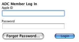 A common joke amongst Mac developers is talking about the Apple HIG, or more specifically the subject of how Apple manages to flout every single principle in user interface design and especially its own in successive revisions of OS X. I've written about this, in one way or another, several times ever since Jaguar came out in August 2002 and the first signs of this disturbing trend became obvious. New UI widgets, new styles and disregard to the HIG continued over the years with Panther, Tiger and now Leopard --- each revision bringing its own flavour of user interface widgets, colour themes and designs, each proving that Apple has no idea what 'consistency' means and that contrary to what they may tell you you should write your own custom widgets or you're probably screwed if you don't (Apple probably writes and uses more undocumented and custom widgets and controls than anyone).
With Aqua so close to becoming part of UI history and Leopard just around the corner, bringing with it yet another completely different UI theme to OS X, it should probably not be surprising when Apple's own Developer Connection web site sports such an inconsistent look. The UI ghosts of yesteryear are still around!
A common joke amongst Mac developers is talking about the Apple HIG, or more specifically the subject of how Apple manages to flout every single principle in user interface design and especially its own in successive revisions of OS X. I've written about this, in one way or another, several times ever since Jaguar came out in August 2002 and the first signs of this disturbing trend became obvious. New UI widgets, new styles and disregard to the HIG continued over the years with Panther, Tiger and now Leopard --- each revision bringing its own flavour of user interface widgets, colour themes and designs, each proving that Apple has no idea what 'consistency' means and that contrary to what they may tell you you should write your own custom widgets or you're probably screwed if you don't (Apple probably writes and uses more undocumented and custom widgets and controls than anyone).
With Aqua so close to becoming part of UI history and Leopard just around the corner, bringing with it yet another completely different UI theme to OS X, it should probably not be surprising when Apple's own Developer Connection web site sports such an inconsistent look. The UI ghosts of yesteryear are still around!